
VIS
A Physical Therapy App
Overview
VIS - Latin for Strength. A motivating workout app for people living with physical disabilities.
ROLE
UX Researcher
UX Designer
METHODS USED
Directed storytelling interviews
Low/mid/high fidelity wireframes
Information architecture diagram and user flow
Prototypes
Usability tests
TOOLS
Sketch
Axure RP 10
Google Slides
Zoom
Pen and paper
DELIVERABLES
The Challenge
Companies such as Centr, Peloton, and Nike Training Club have found innovative ways to motivate people to workout, but have left behind the 61 million adults in the U.S. alone living with one or more disabilities.
Some apps, such as MedBridge GO, allow therapists to create exercise regimens for their patients. These are great tools for patients currently in therapy, but offer little in the way of motivating content to keep them moving post-therapy.
To solve this problem I designed an app specifically for people living with disabilities, or people going through physical and occupational therapy. I conducted research on motivating fitness apps, designed a prototype, and did usability testing to access its strengths and weaknesses.
The Process
Research
I conducted directed story-telling interviews with users of mainstream health apps, to discover what aspects of the apps they found motivating, exciting, or frustrating.
Key findings
Users found motivation through a few key features:
The app allowed them to “window-shop,” browsing through a wide and constantly updating library of content. Finding a new workout that seemed interesting was often enough to motivate users to begin working out.
Users all felt a sense of connection to the people creating the content, whether that be through in-person classes offered as a supplement to the app or the content made within the app itself. Allowing workout apps to contain elements of social networking apps adds a motivating sense of connection with users.
Design
Sketched Wireframes
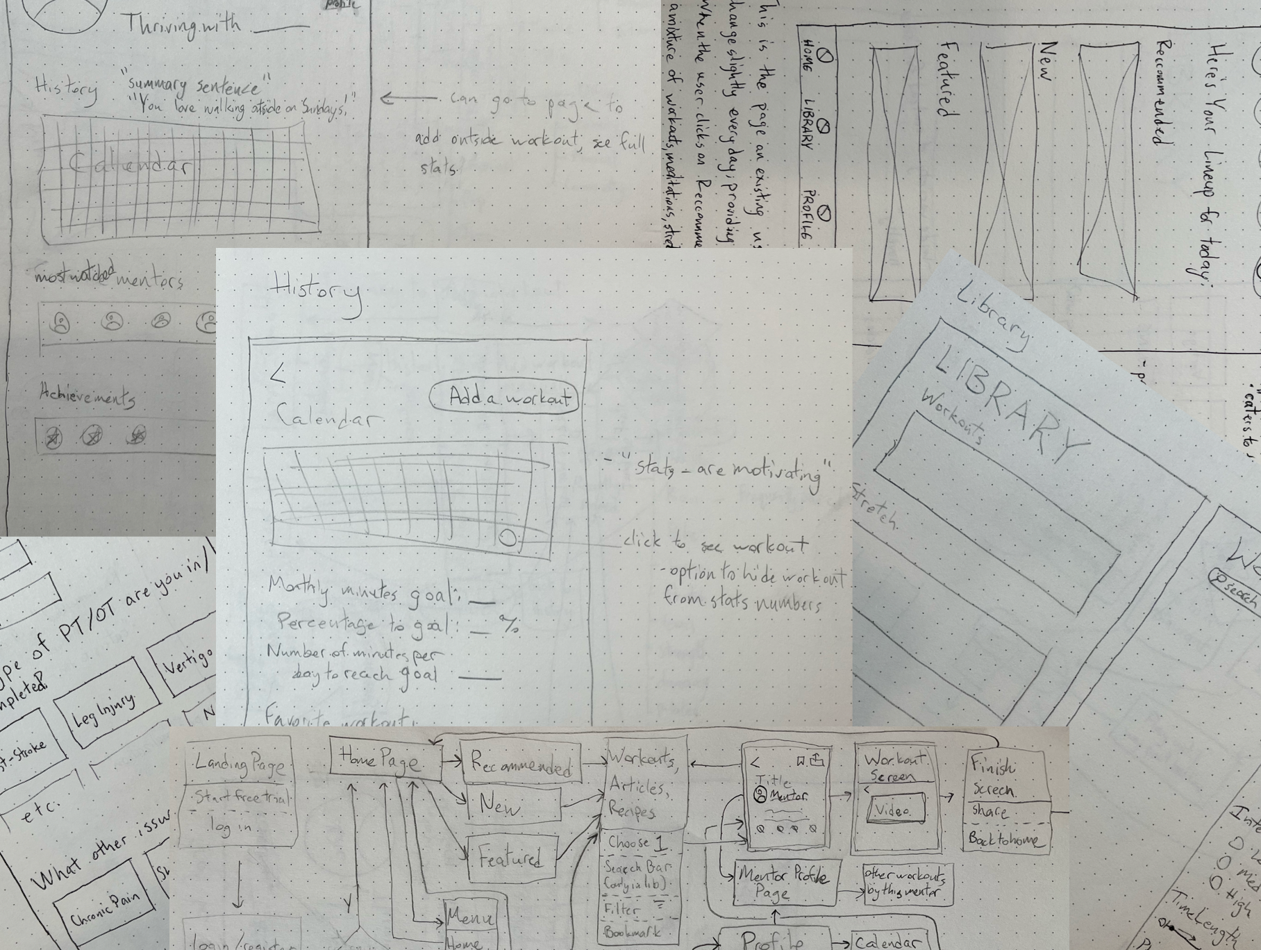
With these findings in hand, I created low-fidelity wireframes, first with pen and paper and later on Sketch.
Three sample annotated sketches of in-app screens. Emphasis was placed on personalization and filter features in these screens.
Digital wireframes

A few of my early mid-fidelity pages. These are the Library, Profile, and History pages, emphasizing a wide range of content, social features, and stats options, respectively.
Information Architecture
In building out the site map, I placed a heavy emphasis on users being continuously led to a workout page.
Because they can arrive via novel ways, a sense of exploration and variety are built into the structure of the app itself.
VIS's site map, with a user flow highlighted in purple arrows. As you can see, the user can go down many different paths that lead eventually to the workout page.

This is the path a user can take to manually add a workout to their stats page, a feature multiple users expressed interest in.
High-Fidelity Prototype
The wireframes were then converted into a mid-fidelity prototype using Axure.
During this whole process, care was taken to emphasize 3 important features:
Tailored content that matches users’ abilities
The sense of “window-shopping” alluded to earlier (Key Findings)
Connection with the trainers who create the in-app content
The log-in screen, profile builder, and library pages of the prototype.
Usability Testing
Once the prototype was complete, I conducted usability testing on four participants, 3 of whom fell in the target demographic of having a disability or having gone through physical- or occupational-therapy.
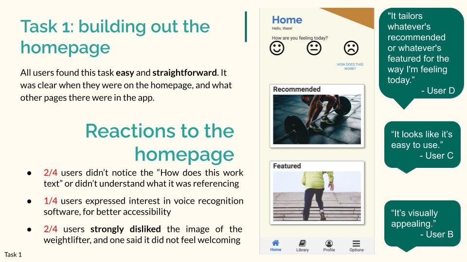
Users praised the ability of the prototype to tailor the content to their abilities and needs, and the feature that allowed them to say how they were feeling each day they log into the app.
Some aspects of navigation, such as the one to log a workout done outside the app, were universally considered opaque and confusing.
An example slide from my usability test report. Users generally found the app to be intuitive to navigate and understand.
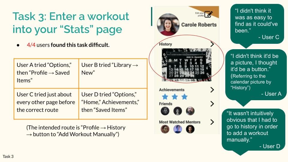
The process of adding in an outside workout was found to be in need of a substantial redesign.
Conclusion
My prototype showed promise in achieving its goals in several areas, as well as several areas in need of improvement. The general structure and navigation were easy to understand. The goal of the app was readily apparent.
Next Steps
Interview health care professionals to learn more about how they treat specific conditions, how they classify and categorize different medical conditions, and what steps people need to take post-care to continue their journey to health while avoiding injury.
Make trainers and authors more visible in the app - no users mentioned feeling a sense of connection with the trainers, which was an important point of motivation stated in the directed-story-telling interviews.
Rework the history and stats page (see usability report for details).
Expand the Achievements section - multiple users expressed interest in this feature.
Expand the range of filter and content options to cater to people who are pregnant, suffer from obesity, or have high-blood pressure or other medical conditions.